MiraVista Behavioral Health
putting a face to mental health care
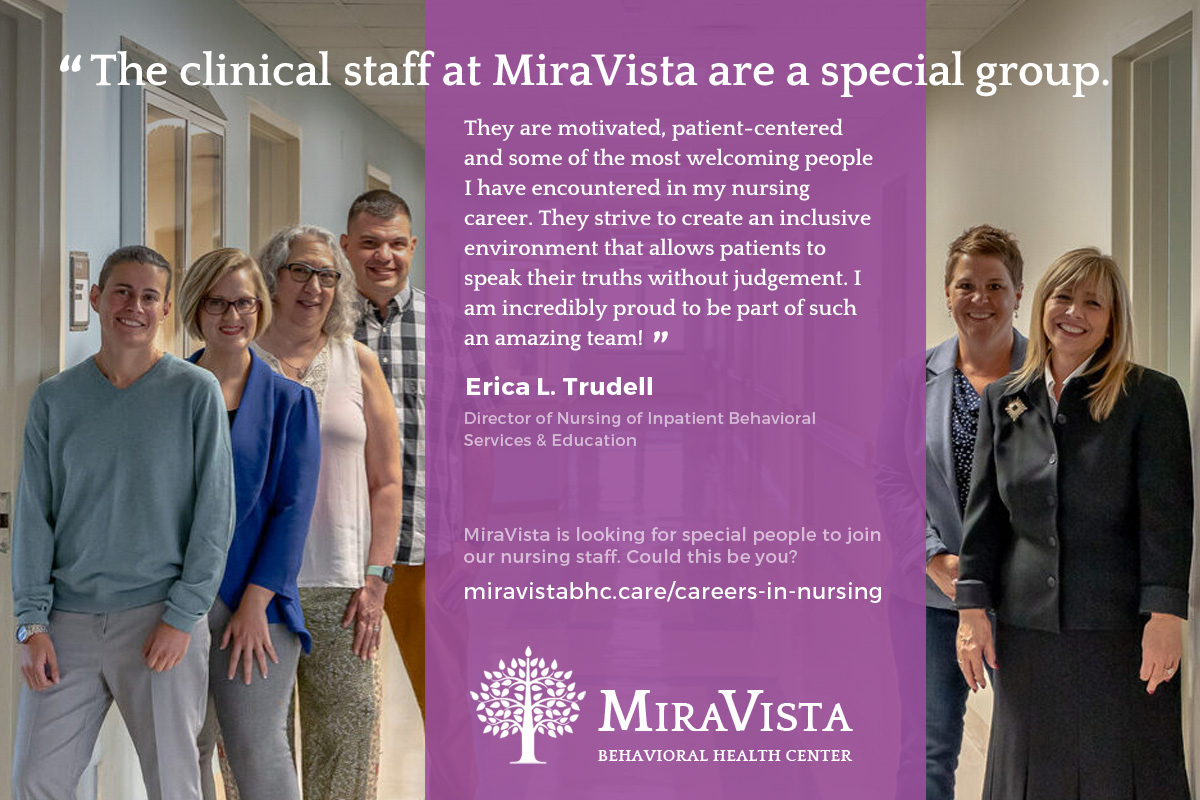
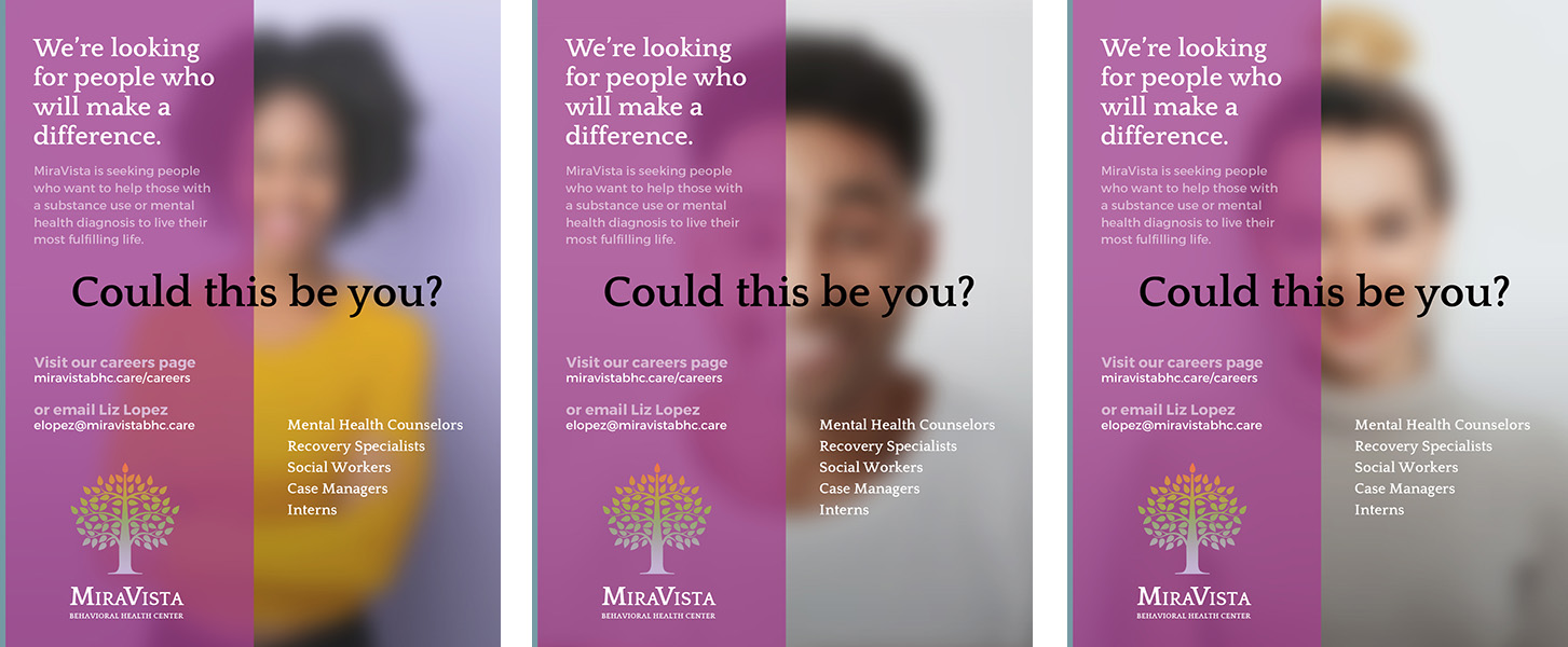
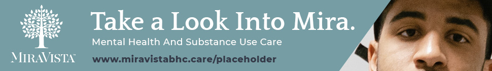
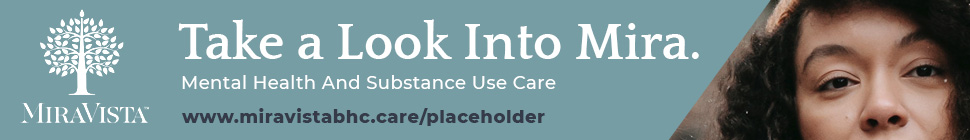
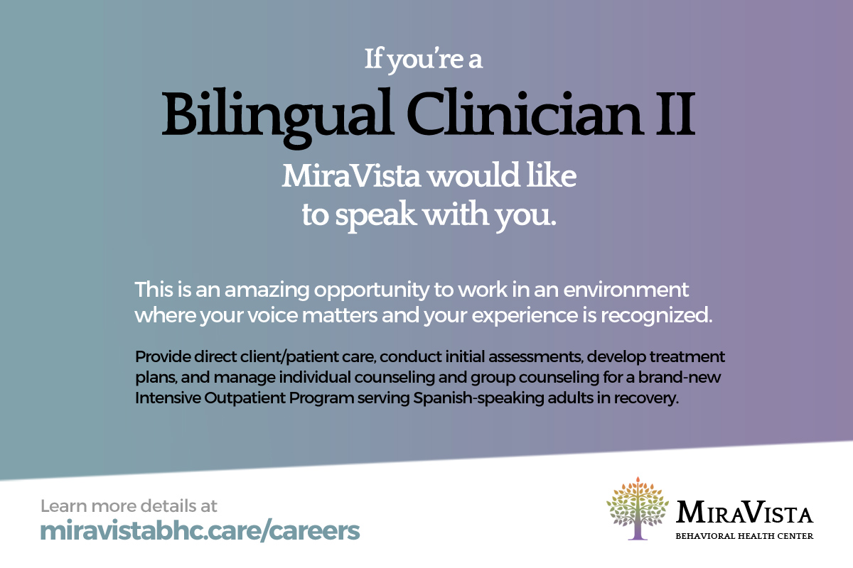
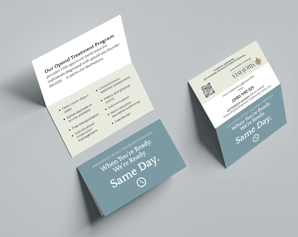
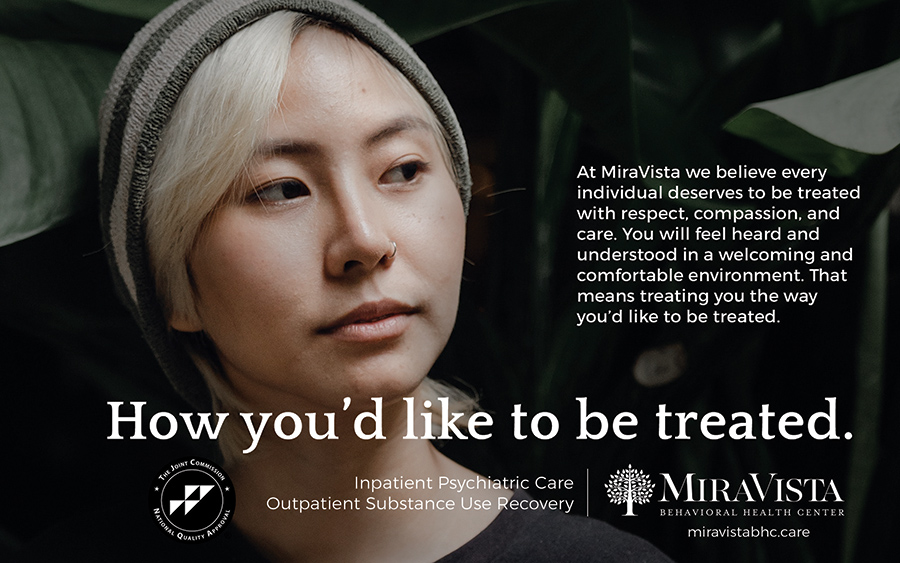
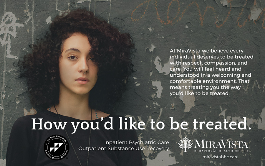
MiraVista is a behavioral health center providing psychiatric and substance use recovery treatment. Their marketing and outreach had focused on graphic elements and flat illustrated characters—easier to pass, I suppose, through a bureaucratic community approval session. When I was assigned the account at Darby O’Brien, I wanted to show real human faces up close and up front, to create a sense of connection with the target audience of potential patients and their loved ones. Nothing is more expressive and meaningful than a human face. But given the budget, only stock photography was possible…so it became an adventure in futility exploring the many stock libraries looking for faces that communicate the truth and imprecision of real life. Stock photos are famously artificial, often because they focus on a single meaning which makes them more searchable. Like an old-timey Delsarte actor symbolizing an emotion with a gesture. The difficulty is to find a face that conveys multiple meanings: a sense of defiance and optimism, of despair and hope. Come to think of it, maybe that’s why MiraVista went with generic cartoon illustrations for so long. They couldn’t “face” it. Once I settled the brand tone, I integrated the look across their print and social presence: print ads, web banners, rack cards and handout flyers, recruitment materials and social media posts.
What I did
- Design
- Copywriting
- Photo selection
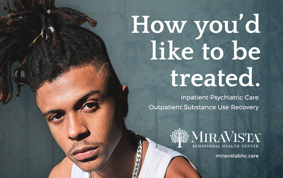
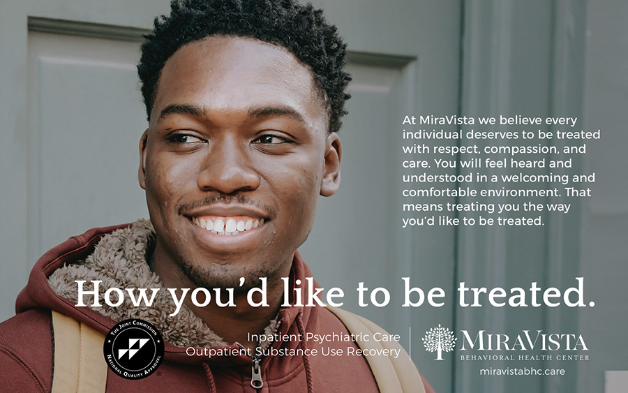

Previous cartoon style VS. real faces
 miravista-style-NEW
 miravista-style-OLD